A brand’s logo is more than just an image that you put on social media and your website. Your logo is truly at the heart of your entire business. It represents your brand on promotional advertisements, product packaging, and everywhere online.
Your logo is how customers will recognise you, what will draw in new potential customers, and how your employees will make themselves known as part of the business.
When it comes to logo design, it is important to create a logo that represents all the best that your business has to offer. Your logo should capture the attention of your audience and make them want to learn more about your business.
With this list of do’s and don’ts, you will be able to create a unique logo that will be clean, modern, and stand out from the rest.
Table of Contents
What Is a Logo?
A logo is a gateway to your business. It should be on every webpage, product packaging, and email you send to customers. Your logo should be unique and recognisable, so that whenever a potential customer sees it they know who you are.

Truly, your logo should capture the essence of your business.
Your logo can be a symbol that resonates with your brand or can include your company’s name within it.
For example, Apple uses a symbol as a logo, while Samsung’s logo includes their name. Both of these are creative and design decisions, but they will impact how your audience sees and recognises your brand.

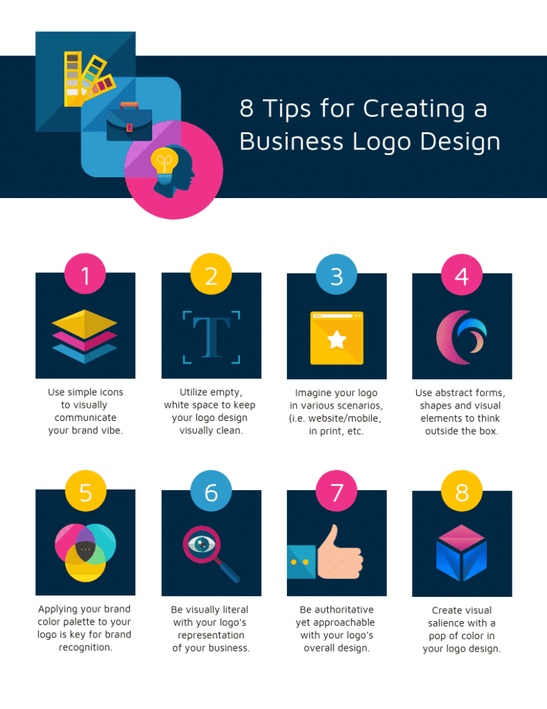
1. Keep Your Logo Simple
Logos are meant to be timeless. Trends change every year, but you cannot completely change your logo whenever something new becomes popular. For this reason, we recommend that you keep your logo simple.
By doing this, you can ensure that your brand is always relevant and will never look dated.
While it can be tempting to try out the latest fads and trends, keeping a timeless logo will allow your brand to stand the test of time. Since your logo will appear on everything related to your brand, it is important for it to look good 5, 10, and 20 years from now.
This isn’t to say you cannot change up your marketing or packaging during seasonal holidays or other important events. This is very doable, but making sure your logo is consistent and recognisable is key.
- Do: Stick with a classic look and feel
- Don’t: Follow temporary trends and change up your logo every couple of years

2. Play Around With Fonts and Uppercase Letters
Your logo’s font is an insight into your company’s personality and what you offer. It lets customers know if your business has a whimsical feel, if you are straightforward and serious, or somewhere in the middle.
Allowing customers to understand the feel of your business is a great way to draw in the correct target audience.
For example, let’s say you’re looking for a new lawyer. You see an ad for a new law office and decide to visit their website. When the page loads, you see all of their branding is in a handwritten, curly font.
This is the exact opposite of the type of font you would expect to see from a lawyer, and may put you off of their services.
Besides the font, another way to make your logo unique is to play around with different capitalisations. Does your brand name look better in all caps? What about your tag line?
These can change the emphasis of your logo and bring your customers eyes to different parts within the icon.
- Do: Find a font that fits the feel of your business, use upper and lowercase letters to draw customers’ attention to important sections of your logo
- Don’t: Use a font that is too whimsical or serious for your business

3. Stick to Your Brand Colours
While your packaging or promotional material may use different colours than those you’ve chosen to represent your brand, it is important to make sure your logo continuously uses your brand colours.
Colored branding is an important part of your brand’s personality and identity. By choosing the right colour scheme for your brand, you can give off different moods or feelings, generate more clicks and sales, and even draw in customers.
Due to this, it is no surprise that your logo should always be in the correct colours.
- Do: Keep your logo in your standard brand colours to ensure recognisability
- Don’t: Constantly change the colour of your logo
4. Take Up Space With Your Logo
No logo will look appealing if it is too cramped. Similarly, it is not good to have your logo be too spread out, either.
For many businesses, a simple icon is not enough to fully explain their brand and what they offer. If this is the case, you can add in your name and tagline to your logo. Taglines are also known as slogans, and are used to encapsulate what your brand stands for in one phrase.
If you don’t have a tagline, don’t fret! You can take up space by increasing the size of your font or even adding in another shape or icon.
While it is important to make use of all of the space you have for your logo, it is also important to leave enough space between your logo and the negative space around it.
If your logo is looking claustrophobic, you can always decrease the font and shape size, or increase the frame size around it.
- Do: Make your logo fill up the entire space provided within the frame, but leave some negative space
- Don’t: Cram your logo into a frame that is too small

5. Make Your Logo Scalable
Your logo should be on everything your company makes, advertises, or posts. Whether it’s the header on your website, a sticker on packaging, or your profile photo on Facebook, your logo must be scalable in order to fit each different dimension you need.
Logos that are too busy and intricate may be difficult to scale down and use as an Instagram profile picture. Contrastingly, logos that are plain may come across as boring when they are used to fill large spaces.
While there is no correct way to build a logo and everyone has different tastes, making sure that your logo is a high resolution file (preferably a vector or transparent PNG) that can be scaled to various sizes means that no matter what, your logo will be legible and look professional.
- Do: Make your logo a high-resolution vector or PNG so it can be scaled to various sizes
- Don’t: Use a small, detailed icon that cannot be clearly scaled up or down

6. Create a Logo that Stands out
The best tip for creating a brilliant logo is to make it stand out from the rest. In the end, you want your customers to be able to pick out your logo from the crowd and remember it long after they’ve left your shop or website.
- Do: Create a logo that pops and draws in your audience
- Don’t: Create a logo that looks similar to the competition, or is not eye-catching
Do: Keep it Simple: The Golden Rule for Powerful Logos
In the world of logo design, less is often more. While intricate details and elaborate artwork might seem enticing, simplicity reigns supreme when it comes to creating a truly impactful logo. But why is keeping it simple so important? Let’s delve deeper into the “Do’s” of simplicity and explore how it can elevate your logo:
1. Avoid Overly Complicated or Busy Designs:
Imagine a logo crammed with multiple colors, fonts, and intricate details. It might look impressive at first glance, but consider its real-world application. Shrinking it down for a business card or displaying it on a mobile app can render it unrecognizable and confusing. Instead, opt for a clean, uncluttered design that retains its clarity and impact across various sizes and mediums.
2. Streamline Elements to be Clean and Memorable:
Think of your logo as a visual elevator pitch. You have mere seconds to capture attention and convey your brand’s essence. A simple logo with carefully chosen elements makes a lasting impression. Focus on conveying your brand’s core values and message through well-balanced shapes, colors, and fonts that resonate with your target audience. Remember, simplicity doesn’t have to be boring. Elevate your design with subtle details that enhance its meaning and memorability.
3. Allow for Scalability and Versatility:
Your logo will be displayed in diverse contexts, from printed materials to digital platforms. A simple design ensures it seamlessly adapts to various sizes and applications without losing its integrity. Choose elements that can be scaled down or up without appearing distorted or losing their meaning. Consider variations for specific uses, like a simplified version for small icons or a full-color version for marketing materials.
Benefits of a Simple Logo:
- Enhanced Recognition: A clean and clear design is easier to remember and recall, boosting brand recognition and building familiarity with your audience.
- Greater Versatility: Adapts readily to different applications and mediums, ensuring consistent brand representation across all touchpoints.
- Timeless Appeal: Simple designs often stand the test of time, avoiding trends that quickly become outdated.
- Professional & Polished: A sophisticated and clutter-free aesthetic conveys professionalism and trustworthiness, building positive brand perception.
Examples of Simple and Effective Logos:
- Apple: The iconic bitten apple is instantly recognizable and embodies simplicity with its single form and clean silhouette.
- Nike: The swoosh logo is a powerful example of minimal design that conveys dynamism and brand identity.
- FedEx: The hidden arrow within the negative space between “E” and “x” adds a subtle layer of visual interest without compromising the logo’s clean appearance.
Don’t: Use Overused Imagery – Stand Out, Don’t Blend In
Logos are powerful symbols representing your brand’s identity. Choosing overused imagery is like blending into the crowd, failing to leave a distinct mark on your audience’s memory. So, ditch the clichés and explore the “Don’ts” of avoiding overused visuals in your logo design:
1. Steer Clear of Cliché and Generic Symbols:
Think lightbulbs for ideas, gears for technology, globes for international businesses. While these symbols might seem universally understood, their overuse dilutes their impact and fails to convey your brand’s uniqueness. Instead, delve deeper into your brand story, values, and target audience. What sets you apart? Can you capture that essence through an original icon or visual metaphor?
2. Opt for Unique, Distinctive Icons and Visuals:
Remember, your logo is a visual language. Choose elements that spark curiosity, tell a story, and resonate with your brand’s message. Consider abstract shapes, custom illustrations, or even negative space designs that create a unique and memorable mark. A logo like Airbnb’s heart-shaped symbol instantly conveys warmth, connection, and the essence of their service.
3. Avoid Clip Art or Overused Stock Elements:
Pre-made clip art and generic stock images often lack originality and can even carry copyright restrictions. They scream “uninspired” and fail to represent the individuality and professionalism your brand deserves. Invest in custom-designed elements or collaborate with a designer to create visuals that truly embody your brand’s spirit.
4. Consider the Cultural Context:
While aiming for uniqueness, be mindful of potential cultural misinterpretations. Research how your chosen visuals might be perceived in different markets where your brand might operate. Ensure your logo resonates positively across diverse audiences and avoids unintentional negativity.
The Consequences of Overused Imagery:
- Lack of Memorability: Blending in with generic visuals makes it harder for your brand to stand out and be remembered.
- Diminished Brand Identity: Overused symbols fail to convey your unique values and message, hindering brand differentiation.
- Potential Copyright Issues: Using unlicensed clip art or stock images can lead to legal complications and reputational damage.
Alternatives to Overused Imagery:
- Abstract Shapes: Explore geometric forms, lines, and patterns that can be imbued with specific meanings relevant to your brand.
- Custom Illustrations: Invest in unique illustrations that visually represent your brand’s personality and story.
- Negative Space Design: Utilize clever use of negative space to create intriguing shapes and hidden meanings within your logo.
- Typography-Based Logos: Play with fonts and letterforms to create a modern and impactful logo that reflects your brand’s voice.
Remember, your logo is a visual ambassador for your brand. By steering clear of overused imagery and embracing originality, you can create a unique symbol that captures attention, communicates your message effectively, and positions your brand for success.
Do: Make it Relevant – Align Your Logo with Your Brand’s Story
Your logo is not just a pretty picture; it’s a visual representation of your brand’s core values, mission, and story. In a crowded marketplace, relevance is key to ensuring your logo resonates with your target audience and leaves a lasting impression. Here’s how to “Do” relevance in your logo design:
1. Ensure Logo Aligns with Brand Identity and Messaging:
Before designing, take a deep dive into your brand identity. What are your core values, target audience, and brand personality? Your logo should visually communicate these elements. Imagine a playful and vibrant logo for a children’s toy company or a sleek and minimalist design for a high-end technology brand. Consistency between your logo and overall brand messaging is crucial for building trust and recognition.
2. Incorporate Industry-Specific Symbols if Appropriate:
Certain industries have established visual cues that can be subtly incorporated into your logo. For example, a stethoscope might be relevant for a healthcare brand, while a globe could symbolize a global business. However, use these elements selectively and with a unique twist. Don’t fall into the trap of relying solely on clichés. Inject your brand’s personality and avoid becoming generic.
3. Visuals Should Connect to Company in Some Way:
What makes your brand unique? Does your company name have a specific meaning? Can this meaning be visually translated into your logo? Explore wordplay, hidden symbols, or visual metaphors that connect your logo to your company’s name, history, or products/services. This subtle storytelling adds depth and memorability to your logo.
Examples of Relevant Logos:
- Amazon: The arrow connecting “a” and “z” subtly represents their vast product selection, from A to Z.
- Twitter: The chirping bird icon directly relates to the act of “tweeting.”
- Apple: The bitten apple, while seemingly simple, has been interpreted as a nod to knowledge, temptation, and even Alan Turing, a pioneer in computer science.
Benefits of a Relevant Logo:
- Stronger Brand Recognition: A logo that connects with your brand story helps build recall and emotional connection with your audience.
- Targeted Communication: Visual cues relevant to your industry or niche attract the right target audience and communicate your expertise.
- Enhanced Brand Trust: Consistency between your logo and overall brand messaging fosters trust and credibility with your customers.
Remember, relevance is not about copying competitors or following trends blindly. It’s about crafting a unique visual identity that authentically reflects your brand’s essence and resonates with your target audience. By making it relevant, you create a logo that goes beyond aesthetics and becomes a powerful brand ambassador.
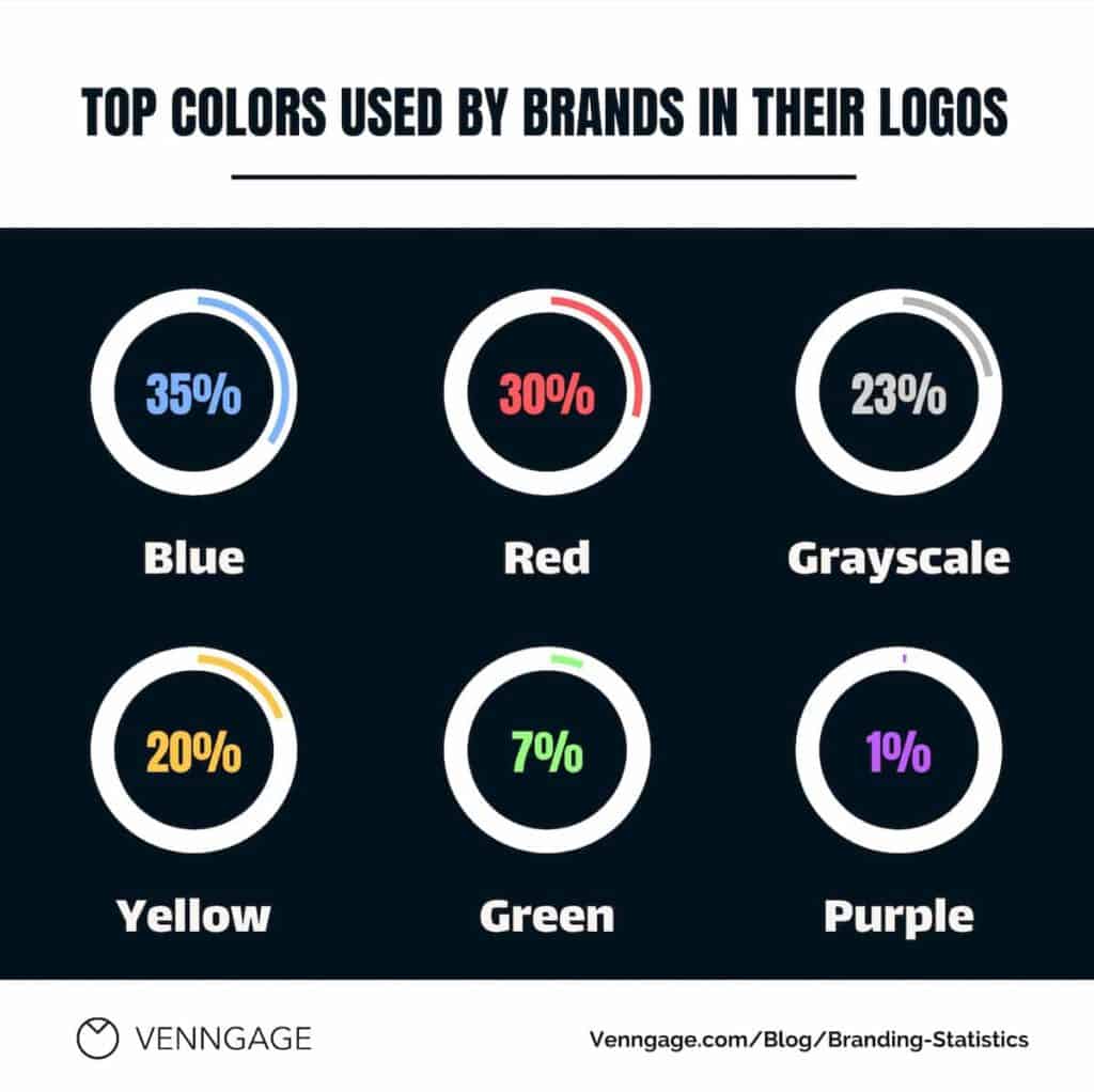
Don’t: Use Too Many Colors – Keep it Clean and Compelling
In the world of logo design, sometimes “less is more” applies not only to complexity but also to color. While a vibrant palette can be tempting, using too many colors can do more harm than good. Here’s why you should avoid color overload in your logo design:
1. Limit Palette to 2-3 Colors for Bold, Striking Logo:
Imagine a logo bursting with five or six different colors. It might appear visually stimulating at first glance, but consider how it translates in real-world applications. Shrinking it down for a business card or displaying it on a website can create a cluttered and confusing mess. Sticking to a limited palette of 2-3 complementary colors ensures clarity, impact, and readability across various sizes and mediums. Think Google’s clean and recognizable primary colors (blue, red, yellow, and green), or Airbnb’s simple yet distinctive red heart icon.
2. Avoid Dull or Overwhelming Color Combinations:
Muted tones might fade into the background, failing to capture attention. Conversely, overly harsh or contrasting colors can create an unpleasant visual experience. Choose colors that are visually appealing, complement each other well, and align with your brand personality. Consider the psychology of color and how different hues evoke specific emotions or associations relevant to your brand identity.
3. Consistent Color Scheme Aids Recognition:
Your logo is a cornerstone of your brand identity. Using a consistent color scheme across all marketing materials and communication reinforces brand recognition and builds familiarity with your audience. Imagine seeing a brand’s logo with different color combinations each time. It would be confusing and hinder memorability. By limiting your palette and using it consistently, you create a unified and easily recognizable brand image.
The Pitfalls of Too Many Colors:
- Reduced Readability and Clarity: A cluttered color palette can make the logo difficult to understand, especially when shrunk down or displayed on various backgrounds.
- Diminished Brand Identity: An inconsistent color scheme weakens brand recognition and makes it harder for your audience to associate your logo with your brand.
- Unprofessional Appearance: An overwhelming color combination can come across as amateurish and detract from the overall brand image.
Alternatives to Excessive Color:
- Monochromatic Logos: Utilizing shades of a single color can create a sophisticated and impactful logo, like Lacoste’s iconic crocodile.
- Duotone Logos: Combining two complementary colors offers a modern and visually interesting approach, like Instagram’s gradient logo.
- Emphasis on Typography: Leverage the power of well-chosen fonts and bold text to create a striking logo without relying on multiple colors, like FedEx’s orange and white design.
Case Studies & Examples: Do’s and Don’ts of Timeless Logos
Do’s: Embracing Timelessness
- Coca-Cola: Since 1886, the iconic script logo with its distinctive tail has remained largely unchanged. It embodies simplicity, clarity, and brand recognition across generations.
- Nike: The swoosh logo, introduced in 1971, represents movement and dynamism with a minimal and versatile design. It has evolved slightly over time while maintaining its core essence.
- Levi’s: The red tab and two-horse logo, dating back to the 1890s, exude classic appeal and heritage. The simple design transcends trends and maintains brand recognition across various product lines.
Explanation: These logos exemplify the “Do’s” by:
- Utilizing classic fonts and color palettes: Coca-Cola’s script, Nike’s black swoosh, and Levi’s red tab avoid trendy elements and rely on time-tested visuals.
- Prioritizing simplicity and clarity: All three logos are easily recognizable even when shrunk down, ensuring versatility across applications.
- Adapting subtly over time: While retaining their core identities, these logos have undergone minor refinements to maintain relevance without losing their timeless appeal.
Don’ts: Falling into Trends
- Beanie Babies: Remember the colorful animal logos of the late 90s? Their reliance on trendy styles led to them becoming quickly outdated and losing brand recognition.
- Gap’s 2010 Logo: The attempt to modernize the logo with a lowercase, sans-serif design sparked backlash from customers and was replaced within a year due to negative brand perception.
- Yahoo’s 2013 Logo: The overly complex design with multiple gradients and fonts lacked clarity and quickly became visually dated.
Explanation: These logos represent the “Don’ts” by:
- Following fleeting trends: Beanie Babies relied on popular animal characters and colors that quickly became dated. Gap and Yahoo incorporated trendy design elements that clashed with their established brand identity.
- Losing simplicity and clarity: The cluttered nature of the Gap and Yahoo logos made them difficult to remember and hindered brand recognition.
- Failing to adapt strategically: The sudden and drastic changes in these logos disrupted brand recognition and damaged consumer trust.
In conclusion, creating a timeless logo requires focus on classic design principles, avoiding fleeting trends, and ensuring clear visual communication. By following the “Do’s” and learning from the “Don’ts,” you can craft a logo that endures the test of time, strengthens your brand identity, and fosters lasting connections with your audience.
Your Logo Can Make or Break Your Business
Some of the most recognisable logos across the world are simple. Think about logos such as Apple’s, Pepsi’s or McDonald’s. You can probably easily picture each of them. Why do they stand out? It most likely has to do with a positive association to their products.
If you create a logo that represents your brand’s identity and values, and tells consumers who you are, people are more likely to be able to recall your logo and think of your brand.
To find out more about growing your brand’s presence, contact ProfileTree
FAQ:
1. How can I tell if my logo is timeless?
Ask yourself: Is it simple and uncluttered? Does it avoid trendy fonts and colors? Can it adapt to different applications and sizes? Does it resonate with your brand’s core values and vision? If you answer yes to most of these questions, your logo is on the right track for timelessness.
2. Is it okay to update my logo if it’s not timeless?
Yes, but proceed with caution. Updating a logo can be risky if it’s not done strategically. Consider subtle refinements to maintain brand recognition while enhancing its timelessness. If a complete overhaul is necessary, involve professional designers who understand the principles of timeless design.
3. What resources can help me create a timeless logo?
There are many online resources offering logo design templates, tips, and inspiration. Consider professional design services for a more personalized and strategic approach. Utilize design software like Adobe Illustrator or Canva to explore different design options.
4. How important is color in achieving a timeless logo?
Color plays a crucial role in brand identity and can contribute to timelessness. Choose classic color palettes that have enduring appeal and avoid overly trendy or seasonal hues. Consider the psychology of color and how different shades evoke specific emotions relevant to your brand.
5. Should I completely avoid using trends in my logo?
Not necessarily. Subtle nods to current trends can add a touch of modernity without compromising timelessness. The key is to avoid overly trendy elements that will quickly become dated. Focus on incorporating trends in a way that aligns with your brand identity and can gracefully evolve over time.
Conclusion:
Creating a logo that stands the test of time requires careful consideration and strategic planning. By prioritizing timeless design principles, you craft a visual identity that resonates with your audience, builds brand recognition, and avoids the pitfalls of fleeting trends.
Remember, your logo is a powerful ambassador for your brand. Invest in its timelessness, and you’ll reap the rewards of a lasting and impactful brand identity that resonates for years to come.


