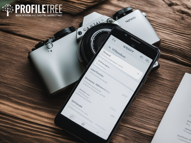
A mobile-friendly website is no longer a mere convenience but an absolute imperative. With over half of all web traffic now originating from mobile devices, neglecting the needs of mobile users is akin to self-inflicted commercial amputation. But what constitutes a “mobile-friendly” website?
In essence, it is an online entity that exhibits the remarkable ability to adapt its layout and functionality to accommodate any viewing platform seamlessly, be it a smartphone, tablet, or even a traditional laptop. For WordPress users, the prospect of mobile optimisation may seem daunting. However, the good news is that this digital transformation is achievable and significantly more accessible than one might initially imagine.
This article aims to provide a complete and detailed understanding of the topic, delving into the profound “why” and the practical “how” to build a mobile-friendly website. We will equip you with actionable strategies and valuable resources, empowering you to mould your website into a mobile masterpiece.
Then buckle up, dear reader, for we are embarking on a journey to embrace the mobile revolution together.
Making Your WordPress Website Mobile-Friendly: A Step-by-Step Guide
Mobile optimisation is a continuous endeavour that requires vigilance. With the advancement of technology and the shifting expectations of users, it becomes necessary to constantly observe and adjust your website to ensure it remains mobile-friendly and user-friendly.

There are practical measures to help ensure your website looks great on mobile devices. Let’s explore these measures together so that you can provide your users with the best possible experience, no matter what device they’re using.
1. Choose a Responsive Theme:
A responsive theme serves as the foundation for creating a mobile-friendly website. It is designed to adapt and respond to different sizes of screens, securing your website’s looks and function on various devices.
When you use a responsive theme, the elements of your website, such as text, images, and navigation menus, will automatically adjust their layout and size based on the screen resolution of the device being used. This means that your website will appear well-optimised and visually appealing, regardless of your visitors’ device to access it.
WordPress offers a vast repository of themes to choose from. These themes are specifically designed to be responsive and mobile-friendly. Browse through the WordPress theme directory, and you’ll find a wide range of free themes available for download. Premium themes are also available from third-party marketplaces and theme developers, often offering more advanced features and customisation options.
2. Utilise Mobile-Friendly Plugins:
While a responsive theme takes care of the fundamental aspects, there is always room for enhancing your website’s mobile experience. You can explore various plugins that can further optimise your site, making it mobile-friendly.
These plugins offer a range of functionalities to improve your website’s mobile experience, from faster loading times and optimised code to user-friendly menus and AMP integration. Consider the following options:
- WPTouch: With its long-standing reputation, WPTouch creates a dedicated, mobile-optimised version of your website. This results in exceptionally fast loading times and a user experience tailored to smaller screens.
- Jetpack Mobile: This versatile plugin offers a comprehensive set of mobile-friendly features, including image optimisation, responsive layouts, and integration with Accelerated Mobile Pages (AMP). It is an all-in-one solution for those seeking a holistic approach to mobile optimisation.
- Hummingbird: Speed enthusiasts, rejoice! Hummingbird focuses on optimising your website’s code and assets to achieve lightning-fast loading speeds on mobiles. This not only enhances user experience but also boosts your SEO ranking.
- AMP for WP: If you want to impress both Google and your mobile visitors, this plugin is for you. Implementing the Accelerated Mobile Pages (AMP) project ensures that your content loads instantly, even on slower connections.
- WP Mobile Menu: Say goodbye to clunky default menus! This plugin creates a sleek, user-friendly mobile menu that seamlessly adapts to any screen size. If you’ve been struggling with navigation issues on mobile, this plugin can provide a solution.
3. Consider Other Niche Plugins:
Keep yourself from the well-known plugins; there are hidden gems worth exploring. These niche plugins offer specialised functionalities that cater to specific requirements. Whether you need optimised image loading, a mobile app transformation, or content customisation for mobile devices, these plugins can provide the necessary solutions.
Pay attention to these hidden gems, which can significantly enhance your website’s mobile experience and user engagement. Take a look at niche plugins that cater to specific needs, including:
Lazy Load for Mobile: This plugin is invaluable if your website contains numerous images. It ensures that images only load as users scroll, conserving mobile data and improving loading times.
WP-AppKit: Looking to transform your website into a native mobile app? This plugin is the solution. It enhances user engagement and fosters brand loyalty by enabling the creation of a dedicated mobile app.
Mobile Smart Content: Take control over the content displayed on mobile devices with this plugin. It’s perfect for hiding non-essential elements, streamlining the mobile experience, and ensuring users receive relevant content.
4. Optimise Images and Content:
It is essential to optimise large images to prevent significant slowdowns on mobile devices. Utilise tools such as Smush or WP Smush Pro to compress your images without compromising their quality. Focus on keeping your content concise and avoid text-heavy blocks. Mobile users prefer easily digestible information that is readable on smaller screens.
Another vital aspect of mobile optimisation is text readability. Given the smaller screen sizes of smartphones, it can be challenging for users to read content that needs to be bigger or more formatted. If you encounter this issue, consider exploring plugins that offer features like responsive typography or text resizing options. These plugins ensure your text is legible on mobile screens, enhancing the overall user experience.
5. Test and Monitor:
Testing and refining your website is crucial once you’ve implemented your mobile optimisation strategies. Tools like Google’s Mobile-Friendly Test and the Mobile Usability Report within Search Console provide valuable insights into how your website performs on different devices. Use these tools to identify any remaining issues and make adjustments accordingly.
Remember, mobile optimisation is an ongoing process. As technology evolves and user expectations change, you’ll need to continuously monitor and adapt your website to keep it mobile-friendly and user-friendly. Following these steps and staying committed to mobile optimisation will ensure that your WordPress website delivers a stellar experience to every visitor, regardless of their device. This will boost your website’s traffic and engagement and solidify your brand as a leader in the mobile-first era.
Why is it Important to Make Your WordPress Website Mobile-Friendly?
In short, making your WordPress website mobile-friendly isn’t just an option; it’s an investment in your website’s success. It opens doors to a broader audience, boosts your online visibility, enhances user experience, drives conversions, and ensures you stay in the loop within the ever-evolving digital landscape.
Don’t get left behind – embrace the mobile revolution and watch your website grow! Here are the reasons why you should make your website mobile-friendly:
Reach a Wider Audience
Imagine the absurdity of closing your doors to half the customers strolling by. In the digital world, that’s what you do if your WordPress website needs to be mobile-friendly. A staggering 50%+ of web traffic now comes from smartphones and tablets. Ignoring them is like locking out a vast potential audience, leaving them to wander your online storefront with their noses pressed against the glass.
Don’t be that shop owner. Open your virtual doors wide and welcome the mobile revolution with a website that adapts and thrives on any screen. It’s not just about staying competitive; it’s about unlocking a world of opportunity you’ve been unknowingly shutting out. So, unlock the power of mobile-friendliness and observe your website flourish!
Boost SEO
Today’s search engine algorithms are harsher than ever, and mobile-friendliness is a crucial factor influencing website visibility. Websites that need to adapt their layout and functionality for mobile devices risk having their content buried beneath a mountain of mobile-friendly competitors.
Google is the dominant guide in this digital maze, prioritising websites catering to the ever-growing mobile user base. In other words, a non-mobile-friendly website, regardless of its content quality, becomes increasingly invisible to most online users. This translates to missed opportunities, dwindling engagement, and stunted growth potential. Such websites become digital islands, isolated from the vast ocean of mobile traffic.
Improve User Experience
Think of your website as a digital storefront. Would you leave your physical store with peeling paint and malfunctioning lights open for business? Of course not! Your online presence deserves the same level of care and attention. Much like a clean and well-maintained storefront, a mobile-friendly website welcomes users with open arms and invites them to explore further.
Prioritising a seamless mobile experience is your path towards positive user interactions that build trust and enhance brand perception. Visitors are more likely to engage with your content, complete desired actions, and, ultimately, become loyal patrons.
Increase Conversions
Seamless mobile browsing is an expectation, not a luxury. Users accustomed to intuitive interfaces and lightning-fast speeds will have no qualms about abandoning a website that fails to meet these standards. This translates to losing potential customers, leads, and brand loyalty. So, you should always prioritise a seamless mobile experience; you foster positive user interactions that build trust and enhance brand perception.
Visitors are more likely to engage with your content, complete desired actions, and, ultimately, become loyal patrons. Remember, first impressions matter; in the digital world, that first impression often happens on a mobile device. So, embrace a mobile-friendly website where you create a smooth and intuitive browsing experience and watch your brand reputation flourish.
Stay Ahead of the Curve
Mobile dominance is the unyielding tide of the digital future. With each passing day, more individuals abandon the confines of laptops for the boundless convenience of their smartphones. Refrain from resigning yourself to such a fate by neglecting to adapt your website to a mobile-friendly mode.
This way, you guarantee your survival in the vibrant new digital age. So, cast off the shackles of the past and step boldly into the mobile-first future. Let your website become a testament to your adaptability, a beacon of seamless experience that attracts and retains the mobile-driven masses. Evolve or face extinction – the choice is yours.
This isn’t just about discoverability; it’s about building trust and fostering loyalty. Mobile users crave seamless experiences, and delivering on that expectation breeds positive interactions. Creating a mobile-friendly WordPress website is a mandate that will give you the satisfaction of watching your business prosper in the future.
 Miranne Khaled

 ProfileTree // 26th November 2023
 Rahma Ali // 9th February 2024